Lighting to Achieve Optimal Appearance
Visual appearance of an object or space depends on the characteristics of the lighting applied. The objective definition of light quality often doesn’t tell the whole story. Light intensity, its spectral composition and distribution in space, as well as individual preference, must be considered. Nevertheless, aiming for the absolute optimum is only recommended when private rooms are concerned. As visual appearance is key in driving consumer demand, it is important to tune the light to maximize effectiveness and visual pleasure for most consumers. Markus Reisinger, owner and CEO of the Lighting Research Studio, discusses this complex situation with examples.
Visual appearance of an object or a space depends on the characteristics of the lighting applied. Among the parameters that influence appearance are light intensity, its spectral composition and the distribution in space. If all parameters are well chosen a consumer will experience the setting as a visually orchestrated scene. If parameters need to be tuned for optimal appearance, then individual preference must be taken into account. It is likely that solutions for different people show similarities, but at the same time it is very unlikely that one setting is optimal for a group of people. This is because different personal experiences do influence expectations. Also different sensory and cognitive capabilities do impact what is perceived. Thus aiming for the absolute optimum is only to recommend when private rooms are concerned. For other spatial situations the immediate goal is to reach conditions that are acceptable for all. In an additional step, the group can aim to find conditions that are close to optimal. As already mentioned optimal appearance depends on the perceiving subject, but it also depends on the context. A person that likes one light setting in an office will characterize the same setting as boring when present in a hotel lobby. For many spaces, objects, surfaces and products, their visual appearance is key in driving consumer demand. Therefore it is important to tune the light to maximize effectiveness and visual pleasure.
Consumer Response and Model
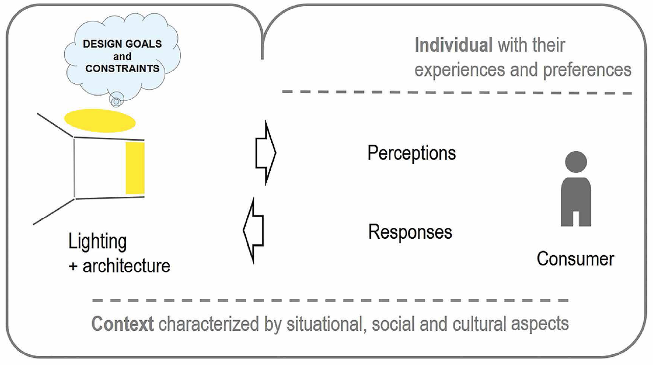
The behavior of consumers is a result of their intentions and how they evaluate cognitively and affectively the situation. The following scheme visualizes how lighting design can influence consumer behavior. By setting relevant goals and following them up in the design, spatial settings are produced that evoke intended pictures and behaviors in the consumer.
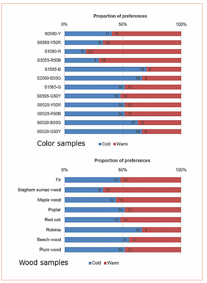
The model points out that individual preference and situational factors are moderating perceptual processes and responses. For example, individual preferences for colors depend a lot on a person’s scope of experiences. What one person likes or dislikes will also depend on the personality and the socio-cultural context that shaped their opinions. Among the situational factors there are sequence effects, social setting, location and time specific features that impact decisions. Good lighting has a positive impact on the experience of a place. Successful lighting concepts take context specific requirements into account. Results from empirical studies are excellent opportunities to ensure that a lighting solution is adequate for given context. Research studies are often executed in idealized conditions, therefore it is important to check that settings are comparable and thus allow transfer of the results. As an example of a preference study, the results of visual appearance under warm (3000 K) and cool (4000 K) LED lighting are provided [1]. The mentioned paper additionally includes a section that shows the usage of semantic space to categorize perceptions along the axes warm-cool and hard-soft.
 Figure 2: Preferences for appearance of color and wood samples in cool or warm light
The results confirm that LED lighting with a correlated color temperature of 3000 K is generally preferred for reddish hues. Cooler light is generally preferred for bluish hues. Preferences for other hues including the pastel samples were not fully conclusive. The wood samples show by tendency, that cooler light suit wood surfaces as robinia better. This cannot be explained by the spectral reflection characteristics. Therefore it can be assumed that the appearance of wood surfaces is influenced by grain, texture pattern and gloss. Focusing on the appearance of materials, one may structure specific characteristics along three modes of appearance. Green-Armytage and Caivano describe that matt, glossy, textured and metallic aspects of appearance are characteristics of the surface mode of appearance. The volume mode can vary between clear (transparent) and cloudy (translucent). In the illuminant mode light sources may appear in varying degrees of brightness with a maximum that can be described as glare [2]. It requires a deep understanding of the effects of light and constraints to master light and therewith optimize appearance. Dependent on the spatial distribution of light surfaces appear uniformly lit or not. The main direction the light comes from articulates itself in the shadowing pattern. Software packages for lighting simulation are today, the most common tools to plan the luminous environment. Rendered pictures simulate distributions of light and the appearance of objects. In the future, descriptions of the light field could become an alternative tool to predict appearance. Also, in the domain of color appearance there are more and more tools available to anticipate the impact that different spectral power distributions of light have. One example is provided by the Illuminating Engineering Society of North America (IES). The technical memorandum TM-30-15 defines a method to characterize color rendering properties [3]. The role of these tools is to link measurable physical quantities to perceptual correlates. Lighting variables that influence visual appearance can be categorized according to their spatial, spectral or temporal characteristics. Technical tools that deal with the spatial and the spectral dimension are mentioned in table 1; Professional tools that cover the temporal dimension are not yet available.
 Table 1: Technical tools to predict appearance
Nowadays, there are an increasing number of software packages for optic simulation and lighting simulation that work with spectral data sets. Most probably not very far in the future, simulations of spatial and spectral domains will merge. Multispectral images are other examples where spectral and spatial data is collected. One bottleneck for these approaches is that there are no displays that are able to represent resulting images.
Case Examples
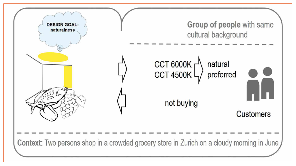
Shopping at the market or in the grocery store? There are certainly many reasons why you should buy groceries either at the market or in a shop. To focus on the impact of lighting, only reasons that impact visual appearance are considered. The lighting design for the grocery store was executed under the premises to achieve a natural appearance. Hence, the chosen light equipment mimics daylight and provides light with a correlated color temperature of 6000 K. The light level is within the range that is typical for shop applications. This case is meant to map challenges that are associated with achieving optimal appearance.
 Figure 3: The grocery shopping case
What the two female customers observe in the shop is indeed, in respect to color, a very natural appearance of fruit, vegetables, meat and fish. On the other hand both costumers have extensive experience from other shops and have in mind that food is often illuminated with light that corresponds to a CCT of 3500 K or 4000 K. Lighting specialists know from a study with multispectral images that an average CCT of 4500 K was preferred for all four food categories [4]. The impression of the customers is that the groceries in the shop don’t look convincing enough. What they implicitly do is to link a not fully satisfying appearance to the quality of the goods and not the light condition in the shop. This behavior is typical. Only when there are very obvious indicators for failures in shop design or maintenance customers start to consider the role of lighting. For the two customers the conclusion is clear, the food in the shop does not look attractive enough so they will not buy here. A short while later the two reach the market. Temperature outdoors is comfortable; the sky has a few clouds. The light level outdoors is somewhat higher than in the shop but the appearance of fruits, vegetables, meat and fish is very similar to the appearance in the grocery store. Despite that, interpretations are quite different. Indeed everything looks natural.
As they are now outdoors, this look is also the preferred one. If color temperature is measured it would prove that it corresponds exactly to the situation inside the shop. In the end, the two customers buy their food here. Unconsciously they also check preference patterns as they look some meters ahead. One person forgot to switch off the halogen floodlight he has used in the morning. The goods shown in a mixture of electric light and daylight do appear in this situation not as natural as the other. They simply look less attractive and are less preferred by consumers at the market.
The grocery shopping case can illustrate several important perceptual aspects. A consumer’s decision is strongly influenced by processes that happen unconsciously. Right at the beginning when a person starts to observe a scene, the human visual system extracts the gist of it [5]. All following perceptions are guided by this first impression. Visual and spatial references also influence what consumers expect and what finally perceive. The case demonstrates how important it is that lighting appears adequate for the given context. It is not that the color temperature per se defines what is preferred. It is the achieved fit with the temporal and spatial context. Being with two persons might also influence awareness about specific details or cause requests to align visual impressions with each other. Through an active exchange, it might occur that perceiving subjects pull aspects of color quality, contrast, and modeling or brightness distribution out of the unconscious state.
For some specific applications there is a strong interest to study visual appearance and preference. One of the fields that are well examined is materials used for car dashboards. But also in such privileged context it is a challenge to understand interactions between color, gloss and texture. Even more complex is the situation when metallic and translucent materials are included. That interaction effects can have a dominant presence and can be easily demonstrated with a material sample that has a directional tread. When the material thread is aligned with the light direction, then the resulting visual pattern is very calm. If lighting direction and thread direction are perpendicular, than the visual pattern is so different to the first case, that the observers do not believe that they are looking at the same material [6].
Summary and Conclusions
Throughout the last few years, enormous progress has been made to differentiate responses to visual stimuli. Today much is known about affective responses, interest, surprise and liking. Also, considerable advances were made in understanding symbolic meaning, semantic interpretation and aesthetic impressions. Models about aesthetic experience suggest that cognitive processing of context and content take place parallel to each other in independent channels [7]. At the same time all approaches to study visual perceptions without considerations of other senses have limits. The framework of total appearance might point out a future direction. It was developed for application in the food sector and integrated nonvisual aspects of appearance such as smell, taste (flavor) and also texture as felt in the mouth, in addition to visual texture [8]. Application domains as shops and museums are recognized for their high demands in respect to lighting quality. Among all solutions that are good enough to be accepted, there are some that are more preferred than others. What science cannot provide are recipes for optimal lighting. But from studies, traits can be extracted that guide design.
References:
[1] Reisinger, Markus. 2015. Preferred LED lighting for wood surfaces and colored surfaces. In AIC 2015 Proceedings, Color and Image, 326-331. Tokyo: The Color Science Association of Japan
[2] Caivano, Jose Luis, and Paul Green-Armytage. 2015. Appearance. In Encyclopedia of Color Science and Technology, ed. Ronnier Luo, 1-9. Springer Berlin Heidelberg
[3] Illuminating Engineering Society of North America. 2015. IES method for evaluating light source color rendition: IES TM-30-15.
[4] Masuda, Osamu, and Sérgio M. C. Nascimento. 2013. Best lighting for naturalness and preference. Journal of Vision 13
[5] Tatler, B. W., I. D. Gilchrist, and J. Rusted. 2003. The time course of abstract visual representation. Perception 32: 579-592
[6] Reisinger, Markus. 2017. Identifying preferred surface, colour and lighting characteristics. Journal of the International Colour Association: 69-76
[7] Redies, Christoph. 2015. Combining universal beauty and cultural context in a unifying model of visual aesthetic experience. Frontiers in Human Neuroscience 9
[8] Hutchings, J. B. 1977. The importance of visual appearance of foods to the food processor and the consumer. Journal of Food Quality 1: 267-278
(c) Luger Research e.U. - 2017

